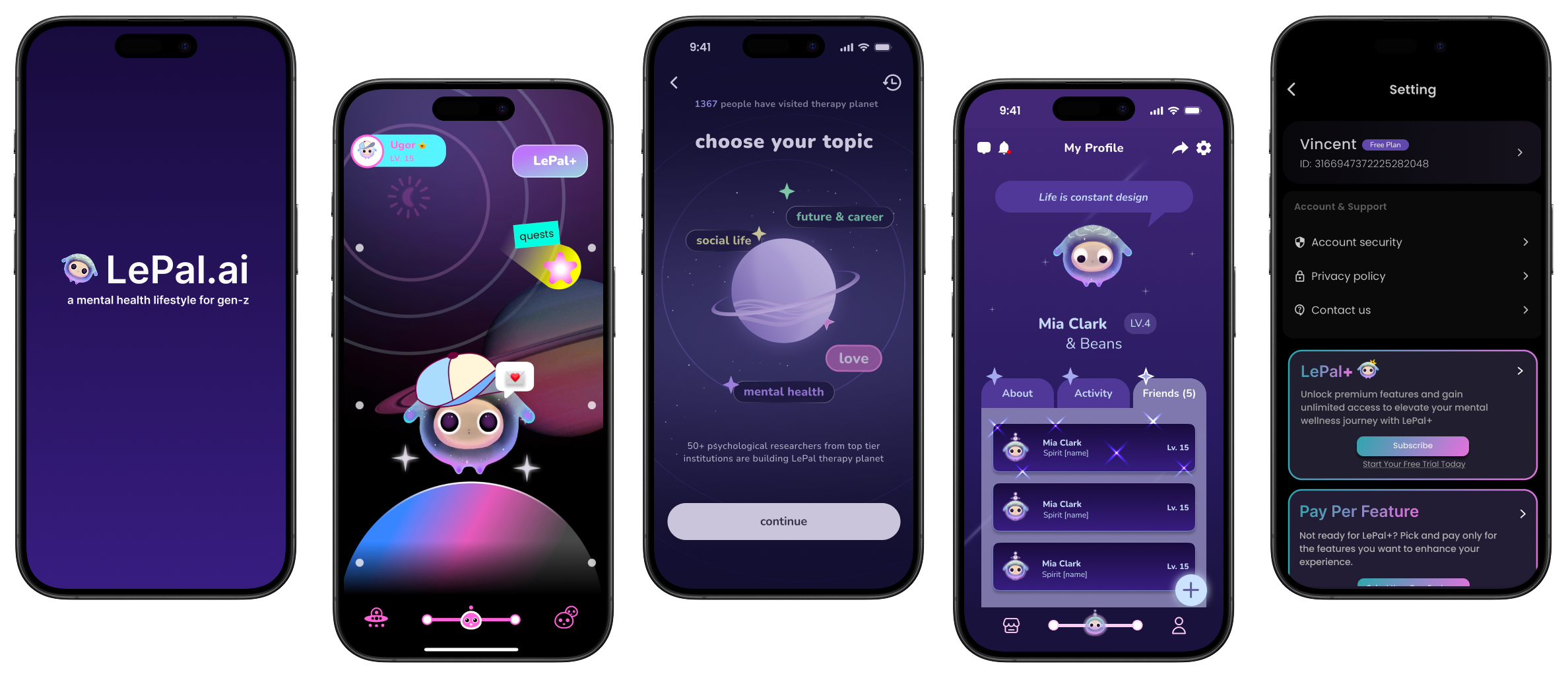
LePal.ai
A Gen Z focused mental health app offering personalized support through self-guided tools and experiences through AI
Roles:
UX Design Lead Intern
UX Researcher Intern
Timeline:
September 2024 - December 2024UI/Visual Design
Usability Testing
Wireframing & Prototyping
Interaction Design
User ResearchResponsibilities:
Background
Setting the Stage
Mental health is a growing concern among college students as they face academic pressure, social challenges, and personal growth. LePal.ai is an app that offers a Gen Z-focused mental health and lifestyle app with personalized, self-guided tools—like journaling, AI therapy chats, and digital companions—to support emotional well-being in a fast-paced, digital world.
As part of my internship at LePal.ai, I explored how design can better support emotional health and self-reflection through digital interaction. My work focused on improving the app’s user experience and overall usability to ensure that users feel supported and understood in every step of their mental health journey. I also worked to enhance the current platform by designing a space for social interaction between peers, encouraging community-driven support, and creating payment screens for users looking to take the next step forward in their mental health journey.
The Process
1
Initial Insights
User interviews
Usability Testing
User Persona
Research
Ideation
Low Fidelity
High Fidelity
Friends Page
2
Ideation
Low Fidelity
High Fidelity
Final Prototype
3
Payment Designs
4
Reflection
Design Logistics & Feedback
Takeaway & Next Steps
Research
Initial Insights
To kick off my internship at LePal.ai, I approached the app as a first-time user with a UX research lens. Over the course of a week, I explored its core features for 30 minutes each night, documenting observations to evaluate usability and identify engagement and interaction gaps. This hands-on audit helped surface key strengths and opportunities to improve emotional support, user flow, and design clarity.
Through this process, I identified eight key features:

Each feature supported LePal’s goal of delivering a personalized and emotionally supportive experience. Tools like Therapy Planet and journals fostered self-reflection through guided prompts, while the item store and pet interactions added playfulness and emotional connection. However, my evaluation revealed areas for improvement—such as unclear navigation, inconsistent feature visibility, and limited peer-to-peer interaction. These gaps shaped my focus on designing more intuitive flows and building spaces for meaningful social connection.
Understanding our Users:
Research
To understand Gen Z users and their mental health needs, I defined a target audience of individuals aged 14–25 who are digitally active, open to discussing mental health, and familiar with gamified experiences. My recruitment strategy focused on both inner-circle connections (friends and family) and outreach to a wider audience through Discord communities, social media platforms, and my university’s Slack channels.


Wanting to see how Gen Z users engage with LePal, I conducted three semi-structured interviews after participants used the app over a 5–10 day period. Exploring user behaviors, motivations, pain points, and expectations in depth found the app’s value as a safe emotional outlet, strong visual appeal, and the importance of features like Therapy Planet and AI pet interactions. Users appreciated reflective tools like session summaries but highlighted issues with customization limits and conversational flow.
To evaluate the overall usability of the app, I conducted moderated remote usability tests with four participants, focusing on core features such as Therapy Planet, journaling, AI interactions, the mood tracker, and report history. Participants shared their screens on Zoom while completing structured tasks and verbalizing their thoughts, allowing me to take detailed observational notes using Miro. This process revealed valuable insights into navigation issues, unclear button functions, and underdeveloped social and reflective features. The study highlighted key areas for improvement—particularly in AI conversational flow and report visibility—while also reinforcing which features resonated with users emotionally and visually.
Usability Testing:
Research


I crafted a user persona to help to visualize the ideal user who would benefit the most from Lepal’s service. This process provided an approach that focused on the goals, needs, and frustrations of a digitally connected college student seeking accessible and personalized mental health support
User Personas:
Research


Based on the insights gathered from Kennedy’s persona, I mapped out a user journey to visualize how a typical Gen Z user might engage with LePal. This journey highlights key moments of emotional need, app interaction, and potential friction points. It served as a foundation for identifying design opportunities that better support users throughout their wellness experience.
User Journey:
Research
Friends Page
Ideation - Designing a Solution:
After the individual research phase concluded, I was tasked with guiding our newly formed team as the UX Lead through the design process. Given we had never worked together before, we faced misalignment in communication and direction in our first project of redesigning the friends page, which made it difficult to establish a clear design vision early on.
Friends Page
Before diving into design, we wanted to better understand the current functionality of the Friends page, which was limited and minimal in features. Our goal was to identify what was already offered and where it fell short in supporting user interaction. This helped us ground our design decisions in what users actually needed.
Understanding our Problem Space

Original Friends ViewFriends Page
Lo-fi & Mid-fi Prototypes

After identifying where the friends page fell short of meeting user needs, we turned to our research to guide us in the next steps. Our team developed lo/mid-fidelities to improve clarity, usability, and engagement. These ideas laid the foundation for our design direction moving forward in our high fidelity.

Mid-fi Design Friends PageFriends Page
High-Fidelity Prototype
With feedback from our stakeholders and potential users, our team moved forward with enhancing our mid-fi to a more polished version of the friends page layout. Emphasizing the design’s need to improve usability, we shifted our final design to be more inclusive while capturing the charisma that LePal conveyed throughout the app.


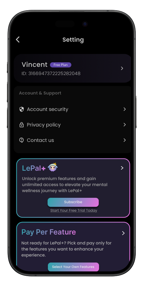
High Fidelity PrototypeContinuing from our previous work, our team was tasked with developing payment processes and new screens for users wanting access to premium features labeled “Lepal.ai+”
After careful consideration, our team implemented two premium access models: a subscription-based model that unlocks all premium features, and a pay-per-feature option that allows users to make one-time purchases for specific tools. This approach was designed to offer users flexibility based on their needs and usage patterns. We also ensured that all payment screens were consistent with LePal’s existing design language to maintain a seamless user experience.
Ideation - Designing a Solution:
Payment Page
Payment Page
Lo-fi Prototypes
Our team begins with upper lo-fi prototypes to showcase the outline of these premium features and compare different plans for free and Lepal+ users.
The layouts are designed to clearly communicate each plan’s offerings and help users choose based on their needs. A comparison screen highlights the added value of LePal+ features compared to the standard experience.


Lo-fi DesignPayment Page
Mid-fi Prototypes
After our team came together for our lo-fi designs, we shifted our focus to enhancing the LePal+ & pay-per-feature visuals in the settings page.
In our mid-fi designs, we prioritized having these options be noticeable and enticing for our users to explore. With a stronger emphasis on attention without overdoing the design, it helps promote these features for users to possibly explore and engage with.


Mid-fi DesignLePal+ Model
For users wanting access to all of LePal’s features, we designed this model to be simple to find and offers guidance of all the new features that come with this plan.
Pay-Per-Feature Model
For those only wanting a specific service, this model allows users to find the feature that best suits their needs.
Final Prototype
Payment Page

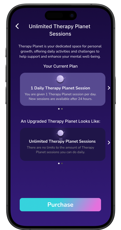


Throughout the design process, we aligned our layouts and components with LePal’s existing design system to ensure consistency and ease of implementation. We made intentional trade-offs between feature depth and simplicity, while prioritizing clarity and ease of navigation to reduce user friction during the decision-making process. With a focus on growing a community within the app, as well as making the space affordable and accessible for students, we carefully considered pricing models and feature access to ensure the platform remained inclusive without sacrificing value.
While our team experienced tight time constraints, it led us to focus on essential user flows first, ensuring the core experience was intuitive and functional. This allowed us to validate key design decisions early on and lay a strong foundation for future development.
Design Logistics
Reflection
Throughout this project, I had the opportunity to independently conduct research and lead a talented team of designers in exploring a problem space that is often overlooked in mental health. It was incredibly rewarding to work on something with real potential for impact, especially knowing our designs could support users in vulnerable and deeply personal moments of their lives. This was also my first experience working with AI-driven tools, which challenged me to think critically about how technology can responsibly support mental wellness without overstepping emotional boundaries.
While I wish we had more time to implement all of our ideas fully, this experience taught me the importance of prioritization and working effectively within real-world constraints. As a team lead, I learned how to navigate differing perspectives and bring the group into alignment, something that didn’t happen overnight but eventually became a key strength of our collaboration. Once we found our rhythm, we were able to produce designs that felt thoughtful, intentional, and grounded in user feedback.
One of the most fulfilling parts of the process was conducting user research and usability testing during the beta stage. Observing genuine reactions and hearing unfiltered thoughts from users engaging with the platform reinforced how important it is to build with empathy, especially in a space centered around personal wellbeing. Their feedback helped inform design decisions and gave our team direction as we iterated toward a more welcoming and accessible experience.
Overall, my time working on LePal.ai deepened my appreciation for user-centered design, collaborative leadership, and the careful balance between innovation and responsibility in the mental health tech space. I’m proud of what we built and hopeful for how it can support students and others in need of a safe, encouraging space to seek help.
My Takeaways
Reflection